Good videos are still losing clicks because of weak packaging. But why?
There are hundreds of thousands of creators on YouTube producing solid content every day. But there’s one mistake that keeps capping the performance of their videos, causing views to fall off, and eventually leading them to lose hope, motivation, and momentum.
Their thumbnails and titles don’t communicate the strongest version of their idea.
A lot of new YouTubers join the platform and get one or two viral videos that take off out of luck. But they quickly realize that their channel isn’t growing as fast as they want it to. And there’s a reason for that.
It’s not because their content has fallen off, or because the quality is lower. It’s because they don’t know how to package their content properly.
In this article, I want to look at what strong packaging actually means and explain the three mistakes I see most often on YouTube.
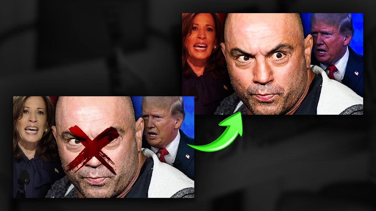
Mistake #1: The Thumbnail Tries to Explain the Entire Video
A lot of the time, I see thumbnails that are far too cluttered. They fail to communicate the actual point of the video because they’re trying to communicate every point at once.
When a thumbnail asks the viewer to process too much before they even care, they lose interest and scroll past to something more compelling—or simply something clearer.
The reason is pretty simple. When you’re scrolling YouTube, you’re not looking for content that over-explains everything in detail. You’re looking for content that catches your attention, sparks curiosity, and makes a promise worth clicking on.
What This Usually Looks Like
So what does this actually look like?
Most failing thumbnails tend to have one or more of the same problems:
- too much text
- too many focal points
- muddy contrast
- no clear emotional center
If you go through your thumbnail using this list, one point at a time, it becomes much easier to spot where it’s falling short.
A good example to start with is thumbnails that use too much text.
When a thumbnail has too many words, the viewer has to stop and read instead of instantly understanding the idea. But people don’t go to YouTube for a blog post or an article—they go there to watch a video.
And when someone is choosing a video, the most they usually want to read is one or two words at most. That’s why shorter subtitles tend to work better for retaining attention. The same principle applies to thumbnails. If there’s too much text, the viewer moves on before they ever become interested.
The same issue applies when you try to fit too much into the image itself. If your thumbnail has too many focal points, too many people, or too many scenes, it becomes overwhelming.
It’s important to remember that YouTube thumbnails are small. On the page, they’re displayed at a minimal size, which means they aren’t easy to study or dissect—especially when the viewer is only giving them a second or two of attention.
Then there’s muddy contrast. If everything in the thumbnail blends together and looks visually similar, the viewer won’t be able to pick out the important details. And when that happens, the pitch your thumbnail is supposed to make disappears.
Finally, there’s the issue of having no clear emotional center. As MrBeast has famously said, a great YouTube thumbnail should make someone who didn’t click it think about it later and say, “Ah, I should have clicked that.”
When a thumbnail doesn’t create that feeling—when it lacks a clear emotional driver, a strong “why,” or a compelling question—there’s no real reason for someone to click.
People come to YouTube for one main thing: entertainment. If your thumbnail sells that effectively, people will click.
How to Solve the Problem
Instead of trying to explain the entire video in your thumbnail, ask yourself:
How can I compress this idea into:
- one dominant visual promise
- one emotional cue
- one obvious point of attention
If you can do that, you give the viewer a much clearer reason to click.
That’s not to say there aren’t exceptions. Some YouTube thumbnails perform well with multiple points of attention—for example, videos ranking celebrities or “Top 10” style content.
But even in those cases, the thumbnail usually only contains one to three main points of interest, and all of them work together to support the same larger idea.
Mistake #2: The Title Describes the Topic Instead of Framing the Hook
One mistake I see a lot of YouTubers make with titles is creating something that is accurate and faithful to the video—but still underperforms.
When that happens, they often lose interest in YouTube and move away from it. But the problem usually isn’t that the title is wrong. It’s that the title summarizes the subject without creating tension, contrast, curiosity, or payoff.
If you summarize your entire video in the title, that may be a good description—but it’s not necessarily a good YouTube title.
A YouTube title has one job: to make someone click.
And if it doesn’t give the viewer a reason to click, they won’t.
What the Best Titles Do Instead
The best titles frame the idea around stakes, novelty, conflict, or a specific promised outcome.
Whenever you click on a YouTube video—or see one that’s going viral—you’re usually interested in it before you even notice how well it’s performing. And there’s a reason for that.
When a YouTube video takes off, it usually means viewers are reading the title, looking at the thumbnail, and seeing something that raises a question they want answered.
That question might be:
- How did that happen?
- When did this happen?
- What is going to happen?
Whatever the exact question is, something in the viewer’s mind remains unresolved—and your title has promised that the video will resolve it.
Mistake #3: The Thumbnail and Title Are Telling Conflicting Stories
This might not seem like a big deal at first, but it’s often a deal breaker for viewers.
When the thumbnail and title compete with each other instead of reinforcing one unified promise, the packaging of the video breaks down completely.
Viewers want clarity. If your thumbnail starts to sell them on one idea, your title needs to continue that same sale—not pull them in a different direction.
If your packaging is mismatched, it doesn’t reinforce the core promise your video is supposed to deliver on.
If the thumbnail poses one question but the title poses another, or if the thumbnail provides the hook while the title gives away the whole payoff, you weaken the click before it ever happens.
What This Looks Like
A lot of the time, the thumbnail suggests one specific angle while the title suggests another. When that happens, the viewer doesn’t get a clear idea of what the video actually offers.
And if they don’t understand what they’re being invited to watch, they have no reason to click.
Instead of feeling curious, they feel confused. And while those two reactions may seem close, they are completely different when it comes to getting someone to actually click on your content.
What to Do Instead
A better way to think about it is this: the thumbnail and title should function like one complete sentence split across two surfaces.
They are not separate pieces of content.
It’s similar to a book cover. The title of the book has to reinforce the image on the cover, and the image on the cover has to reinforce the title.
If the title of your book is The War of the Worlds but the cover shows a teacup, that creates confusion. It doesn’t match the promise.
But when you look at War of the Worlds covers, most of them clearly deliver on that idea and make the reader curious.
It feels like a war of the worlds.
A Simple Packaging Check Before You Publish
Before you publish, it’s important to ask whether the core promise of your video is instantly understandable.
One way I like to do this is by sending a screenshot of the title and thumbnail—often using my free title and thumbnail viewer—to a friend.
If they can’t instantly tell what the video is about, that’s usually a sign I shouldn’t publish yet.
And if you don’t have anyone to send it to, you can still ask yourself a few simple questions:
- Am I posing one clear question with this title and thumbnail?
- Does this feel like one coherent cover?
- Or does it feel disjointed, mismatched, and confusing?
If it feels confusing, the title and thumbnail still need work.
Good Content Deserves Better Packaging
It’s important to remember that packaging is not manipulation.
A book cover doesn’t manipulate you into reading it. People always say, “Don’t judge a book by its cover,” but the reality is that most of us do. We judge books by their covers, and we judge YouTube videos by their covers too.
The best packaging isn’t misleading, and it isn’t cheap clickbait. It’s a genuine promise.
It offers the viewer something compelling—the chance to learn something, answer a question, or discover something new—and then it delivers on that promise.
If you'd like to check out my services, you can do so on my creator page, because this is also something I help with directly.
I'm a YouTube thumbnail designer with over seven years of experience, and if you'd like to chat about how to take your channel to the next level, go ahead and fill out a contact form there.